Charged
For those seeking an electric alternative
Concept:
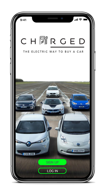
Charged is a concept designed for all the users that are considering making the transition from a internal combustion engine vehicle to an electric alternative. It is similar to car buying apps but the biggest difference is that the app only focuses on showcasing electric and hybrid vehicles to the users.
The Solution:
A clean and easy to navigate interface that offers a charging station locator, profile where you can save your vehicles and set up a test drive. Range anxiety was one major pain point that was found throughout user testing and research which is when the "Charging station" locator was implemented. This app allows the user to make a change and better our environment by driving greener vehicles that don't negatively impact our earth.
The Process
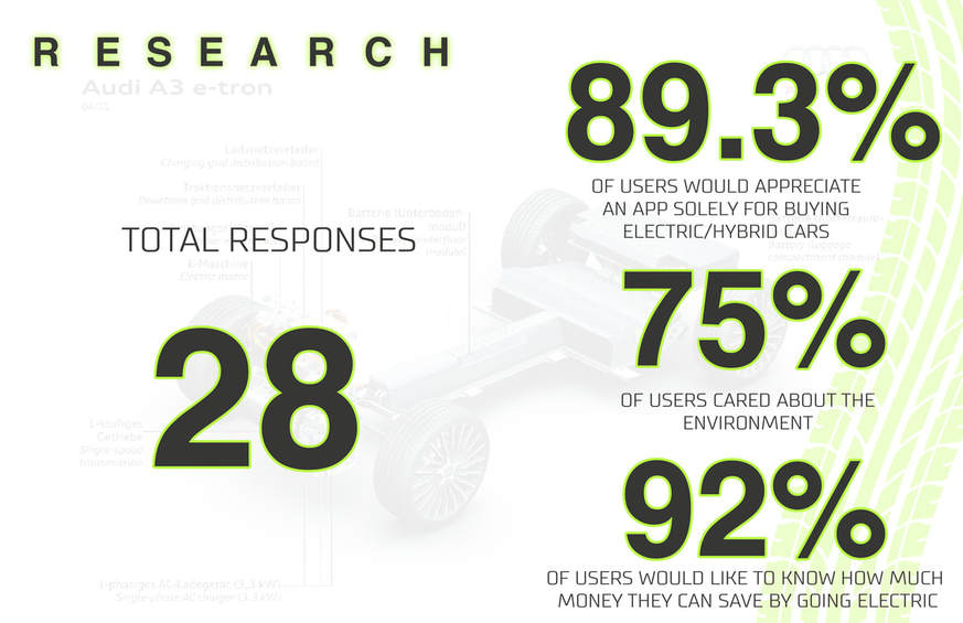
I started off by working on a survey to capture data and test it with potential users and see if this was something that would make sense in designing. It turned out that the idea of a "green" alternative to purchasing just electric and hybrid cars proved popular among the people who took the survey. I did competitive analysis and there was an opportunity in the app market for such an idea, especially with the popularity increasing with electric and hybrid vehicles.
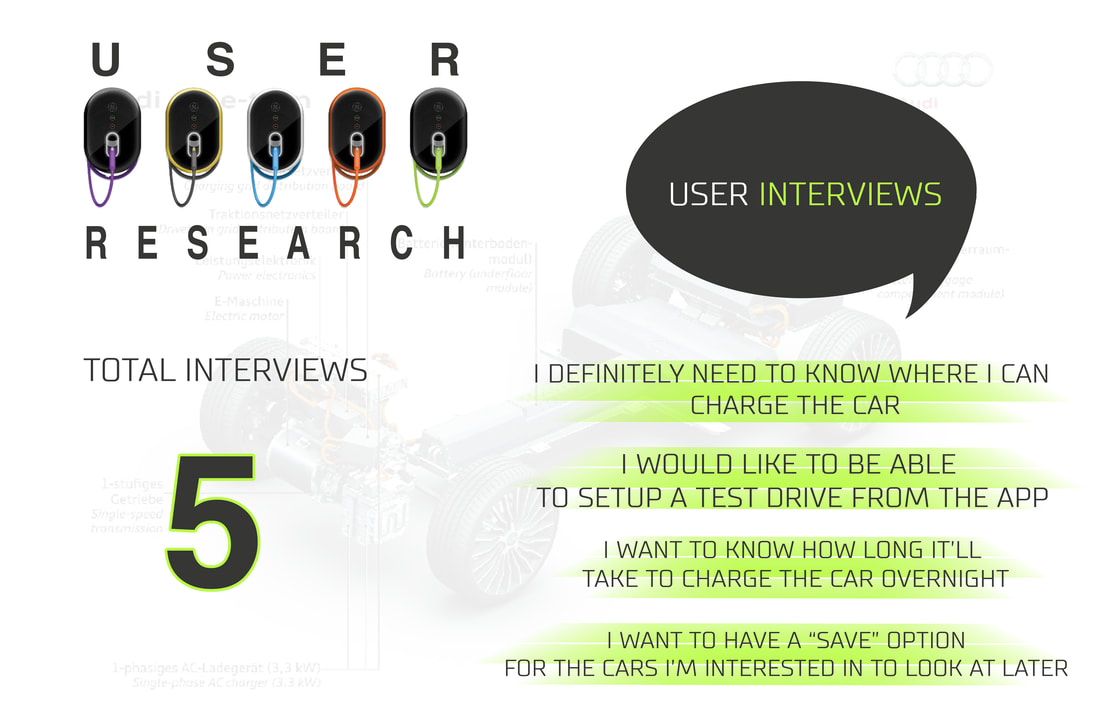
Throughout the interview process, I was able to gauge more or less the path that the design would go. I was able to learn about the user's concerns, what features they thought were necessary and what they didn't need. I gathered that one of the most pressing concerns were " I want to know where I can charge my car". One example was, "If I'm on a road trip, I won't be at ease not knowing where to charge up and would not want to be stranded anywhere". This was definitely an opportunity to incorporate that into the design iterations.
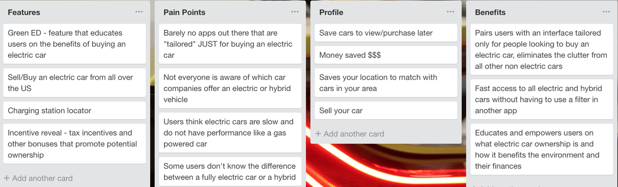
This diagram gave me an overview of features that need to be implemented within the app, understanding the user's pain points and making sure to address them by providing clarity on those concerns. The diagram provided a great deal of insight and clear direction on moving on to the next phase.
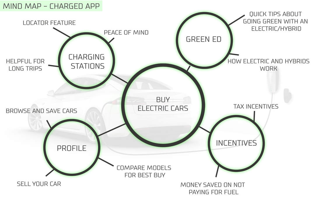
With the mind map created, I was able to continue streamlining information collected throughout the trello diagram. It is basically the foundation for the actual features that will be on display on the interface for the users. It will allow the users to buy electric cars, incentives will be offered to the users for driving green, they will have their profile, charging station locator and something called "green ED" which educates the user on all things that relate to driving electric cars to how much money they save annually to how they contribute to overall sustainability and a "greener" earth along with federal tax incentives offered.
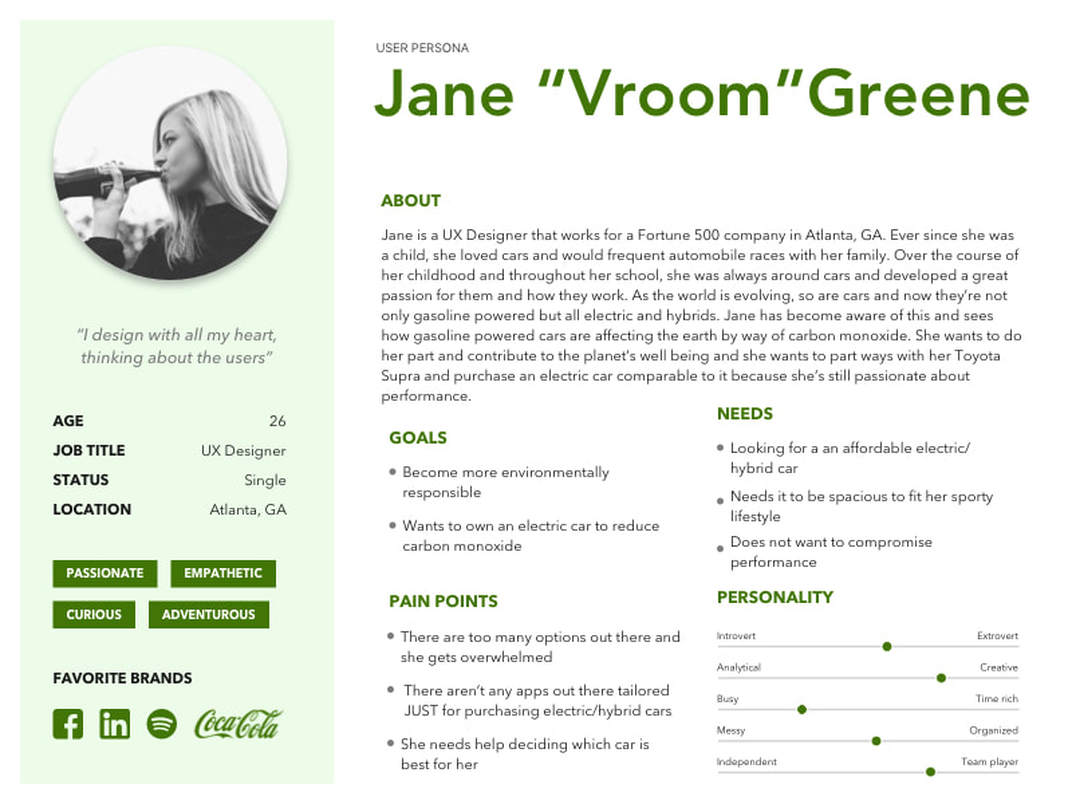
Here we have the user persona that we centered our design around. Highlighting all her concerns and making sure that we addressed them and provided a solution for her pain points were the highest priorities before we could jump into the design of the interface. Jane wanted to make the transition to driving electric but couldn't shake off all the stigmas that surrounded electric cars. It was also very important to Jane to not compromise performance since she was transitioning over from a sports car. Apart from performance, she also needed something spacious.
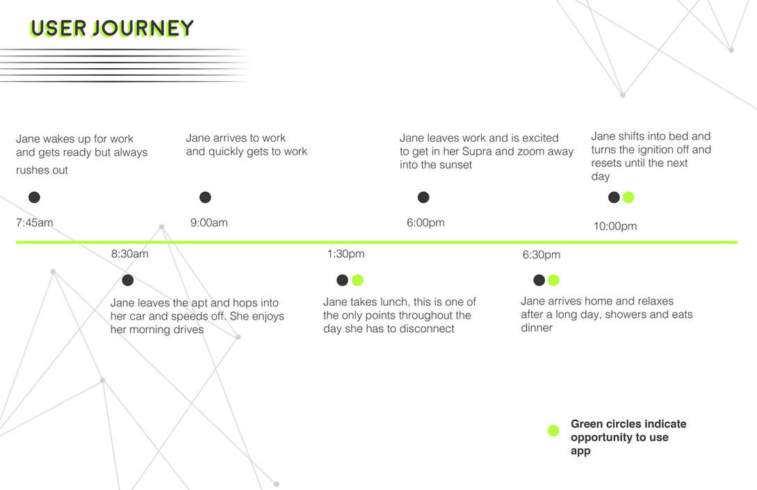
When designing Jane's user journey, we were able to highlight the areas where she would be able to use the Charged app, the opportunities were highlighted by a neon green circle. Her lunch break, arriving home and right before going to sleep were Jane's opportunities to use the app to search for her new, electric ride.

At this point, we have gathered all the research that will assist us in making sure we are designing the right app for the right target audience. During the sketches, I made sure to incorporate all the features that were mentioned previously throughout the research that would empower and enrich the user's experience with the app. A clean and modern interface was the goal, something that would also be straightforward and not confuse the user during their interaction. I had looked into other competitors and gathered some design cues that made sense and obviously left out what was unnecessary. On to the Mid fidelity prototypes...
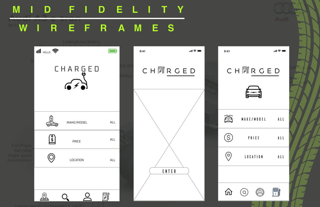
Here we arrive to the mid fidelity prototypes of Charged...simple, clean and comprehensive was what I wanted for the users so they would not have any difficulty navigating through the interface. The first and third "home" pages shown above would showcase the logo itself, three tabs where the user can search for a car and the navigation bar on the bottom with "home, search, profile and charging station locator for the user. As more feedback was received and further testing was done, the design went through several iterations before becoming more refined but at least we had a starting point.
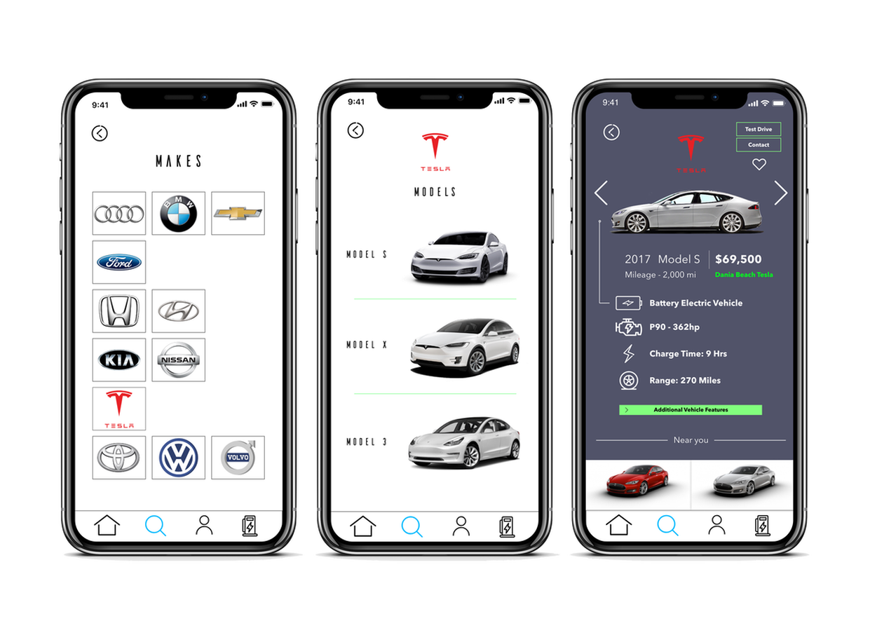
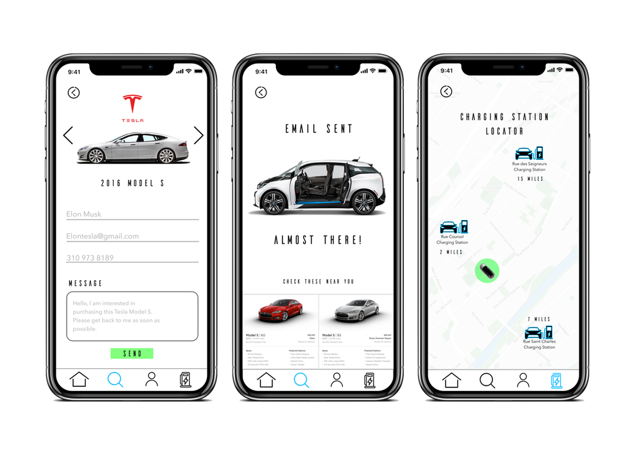
High Fidelity Prototypes
My Thoughts
The overall design of Charged was a success with great reception throughout its development and processes. It had a high adoption rate by a great majority of users that I tested the app with. A lot of the users I tested with stated that this would easily be an app they would use daily to research how to purchase an electric or hybrid vehicle and would definitely recommend to friends. Throughout the process, I learned a lot about what was critical and what was secondary that could be left off the first version. Going forward, I would like to incorporate the "green ED" feature that would basically show as a banner slightly above the navigation bar with a new message about driving electric for the user to read and remain engaged and interested in their search for a greener ride.