QuikFit
The fitness app for everyone on the go
Concept:
QuikFit Fitness app was designed for the those that have difficulty finding the time to workout. It's quick and easy to get in a workout and log the results without missing a step in your day.
The Solution:
Design an app for the users that don't have time to workout due to hectic schedules. Provide them with a simple and engaging interface that allows for a seamless workout. Incorporate music into the app to keep the user motivated and on track.
The Process
Before QuikFit became what it is now, I had to conduct some research to determine the direction of the project and who we would be developing it for.
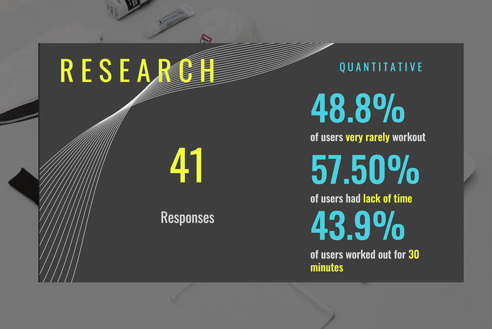
I created a survey with questions and was able to receive 41 responses from survey takers. Amongst the results, the ones listed above were clear indicators that I would have to center the design and layout to make sure that we would encourage more users to workout, respect their small window of opportunity to workout and making sure the interface is quick and simple to navigate to decrease "time on task".
I created a survey with questions and was able to receive 41 responses from survey takers. Amongst the results, the ones listed above were clear indicators that I would have to center the design and layout to make sure that we would encourage more users to workout, respect their small window of opportunity to workout and making sure the interface is quick and simple to navigate to decrease "time on task".
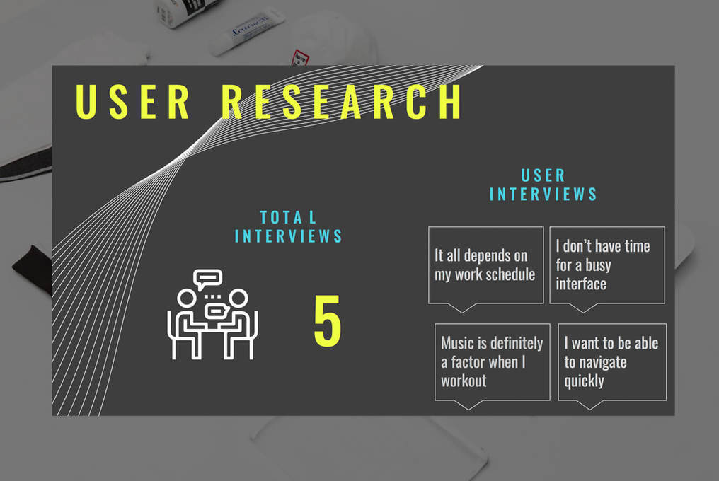
After concluding with the survey questions to get some data going, I also conducted interviews with 5 potential users. Their input and feedback as well provided clear direction for where the design and purpose of this app would go. Various factors affected the user's ability to get in a quick workout such as lack of time while other users cited that the fitness app market was heavily saturated and that some interfaces relied mostly on the aesthetics rather than the functionality...that type of design definitely is not user centric...this was obviously something I would take into consideration later in the developmental phases.
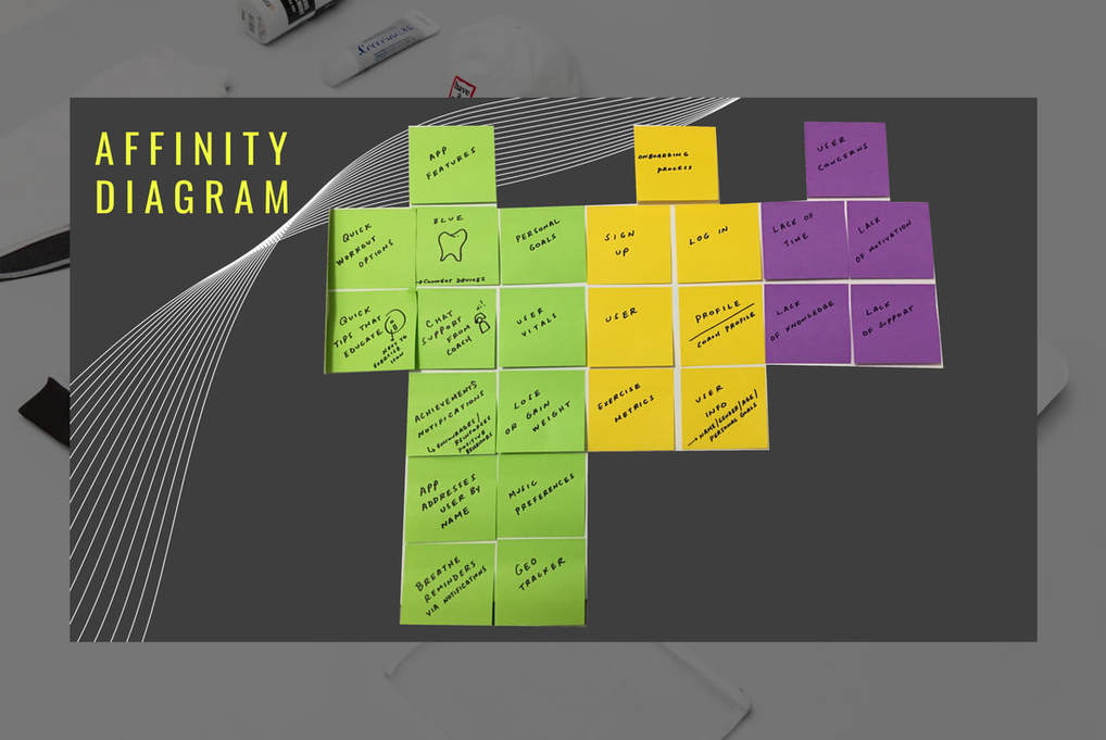
Here, we arrive to the Affinity diagram where I was able to loosely brainstorm ideas that would also guide me in translating what the app would need to have, the pain points associated, user concerns and so on. It provided a great canvas to extract data from and helps you hone in on what the user actually needs and what's "fluff".
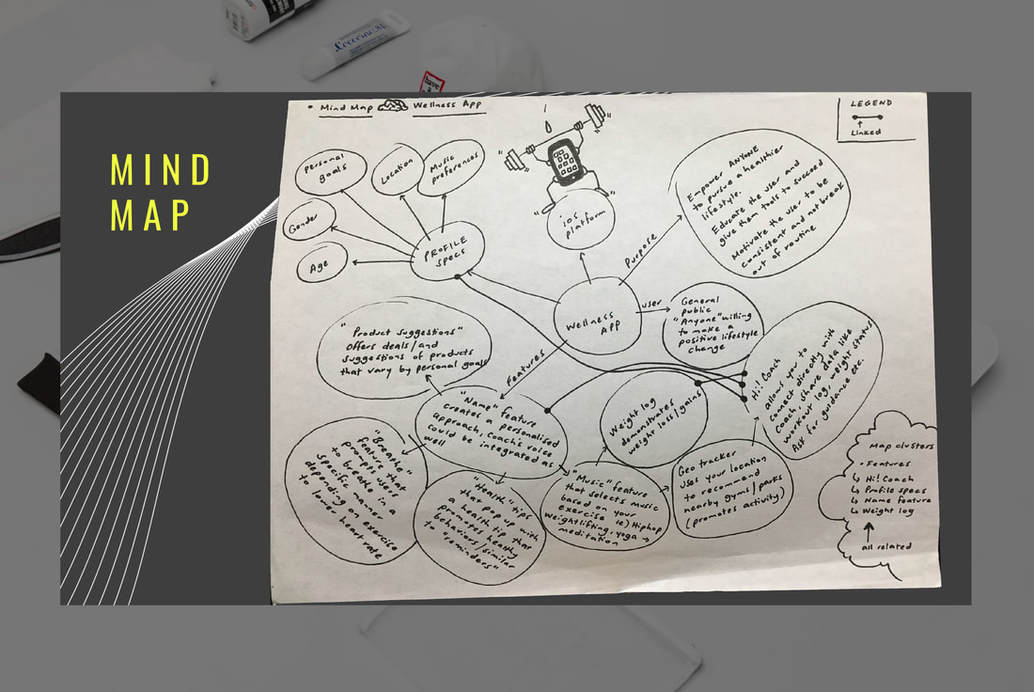
With the Mind Map, I was able to organize clusters of information and dive more into details of what the app would have and what the needs of the user are going to be. I was able to dig deeper with profile specs and determine what the profile page would need to enrich the user's experience while navigating. I also took this time to ensure I addressed pain points and provide a solution.
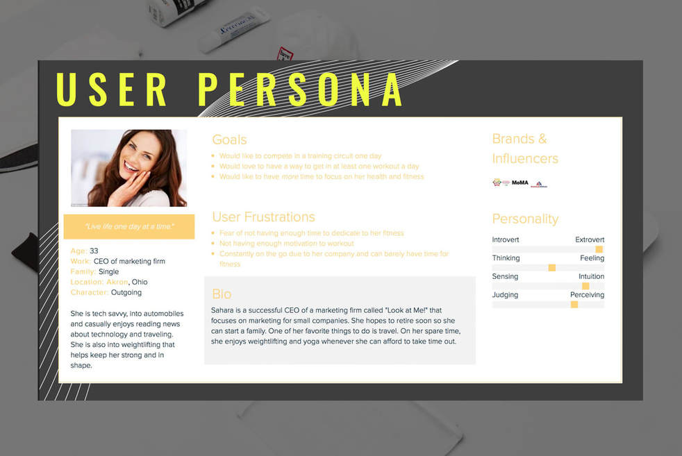
The User Persona definitely provided a lot of clarity and was able to provide perspective to the overall project since this was a real user we were designing for. Here, you're exposed to the user's frustrations and what their goals are as well as a short bio on who they are. The user frustrations assisted with steering away from certain design cues and made sure we stayed the course when developing the app.
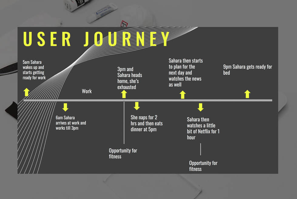
The User Journey would help us by providing an insight into the life of the user and allow us to pinpoint where the opportunities to utilize the app might be. In this case, the user had 2 opportunities throughout her busy day to get a workout in, when she arrives home and then when she watches Netflix.
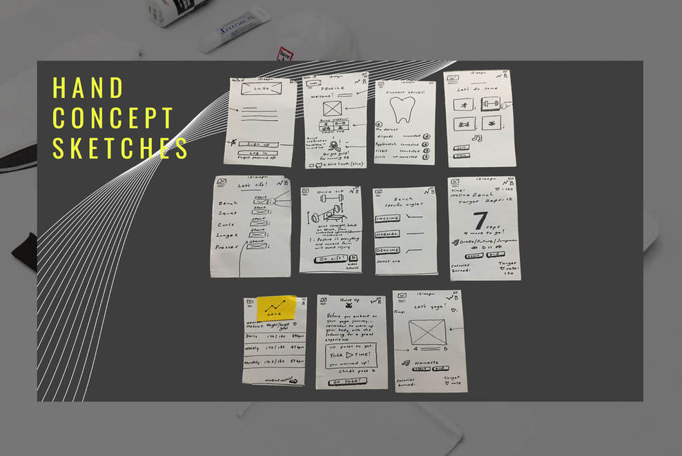
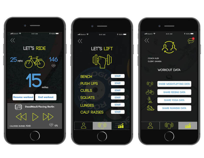
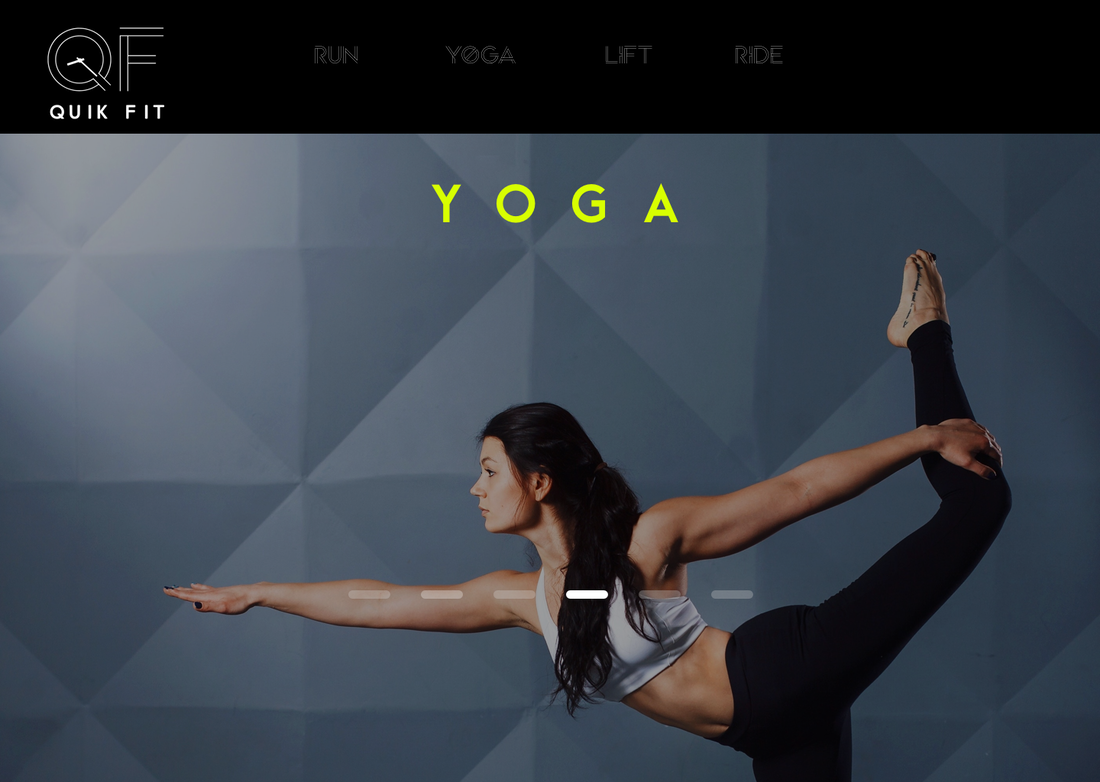
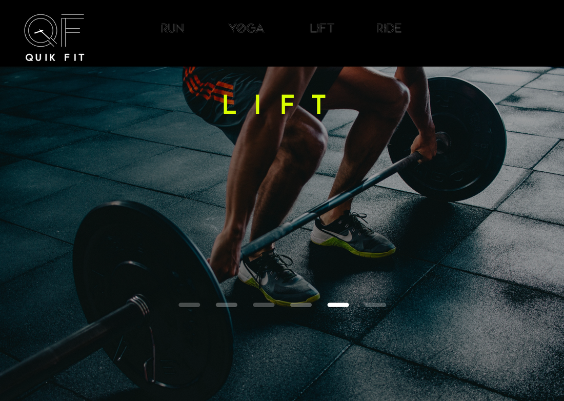
After the research was conducted and results were validated, I started sketching the foundation of what I wanted the interface to look like. The idea behind QuikFit was to provide an easy to read interface along with the ability to navigate quickly through a workout. The main workout screen would have "Running, Weightlifting, Yoga and Cycling". Other features would be to share the results with a coach as well as having music incorporated into the app unlike some fitness apps where a user needs to toggle between the fitness app and their music app simultaneously which in turn interrupts the focus of that individual.
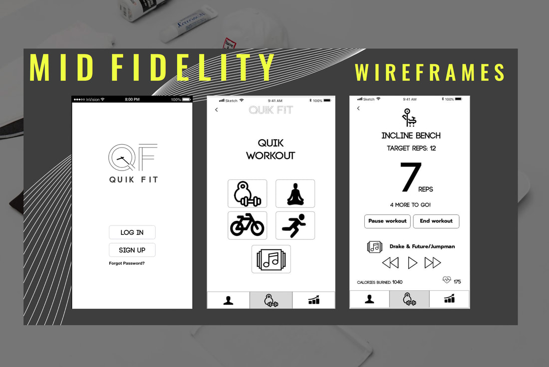
After I completed the sketching the screens that would provide structure, I started using Sketch to jumpstart the mid fidelity screens to get a more realistic feel of the interface. This also allowed me to pin point the actual functionalities of buttons, placement of icons etc along with user testing gave the project more direction. As I tested the screens with fellow peers, their feedback was critical into shaping the mid fidelity further until we arrived to the high fidelity prototype, omitting unnecessary features or screens along the way.
|
|
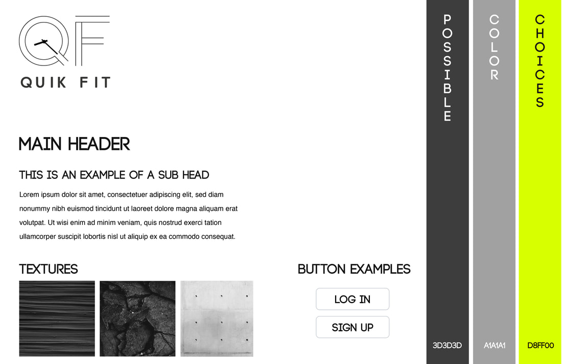
Before I could dive into finalizing the high fidelity, I had to ensure that I had a proper foundation to build the overall design upon. I started with a Style Tile that had information such as the fonts being used, textures, button examples and main color palettes to be utilized. I wanted neutral colors as well a pop of neon to "engage" the users and grab their attention while in the app.
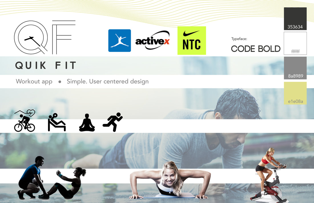
I also designed a Mood Board which would help me by looking at comparable apps and also setup a "brand guide" for what I believe the app would stand for which in this case was simplicity, determination, drive and ambition. The images selected also depicted that you could get in your quick workout anywhere, not isolating the gym as an only outlet. From here, I would start building the high fidelity.
I also designed a Mood Board which would help me by looking at comparable apps and also setup a "brand guide" for what I believe the app would stand for which in this case was simplicity, determination, drive and ambition. The images selected also depicted that you could get in your quick workout anywhere, not isolating the gym as an only outlet. From here, I would start building the high fidelity.
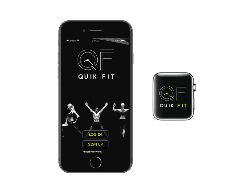
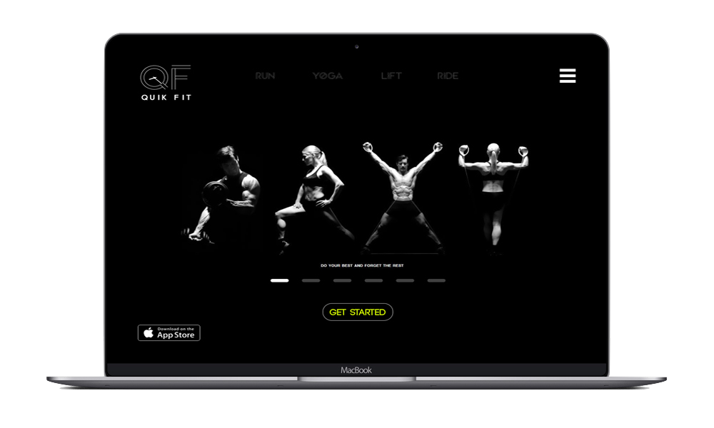
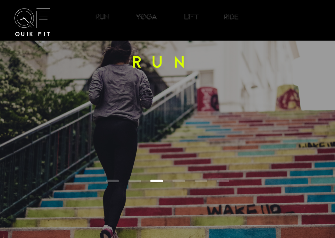
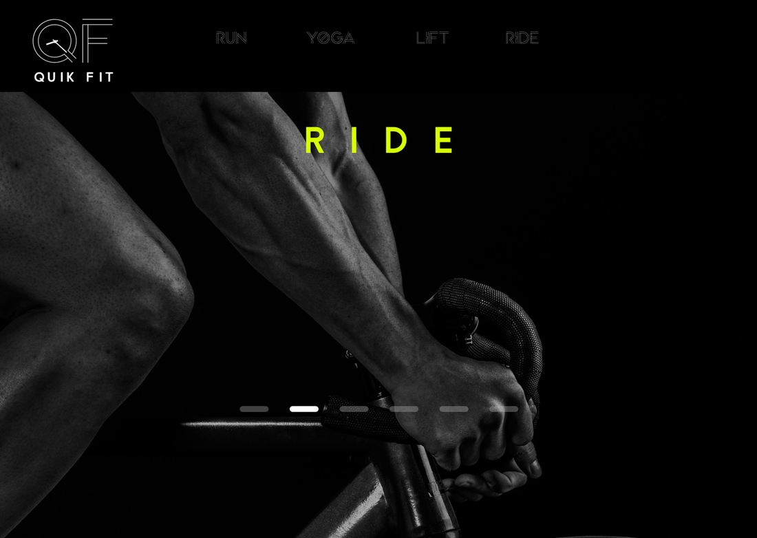
High Fidelity Prototypes
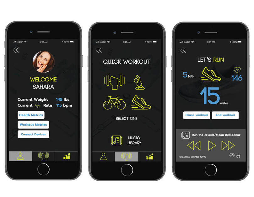
Landing Pages
|
|
My Thoughts
Going forward, I would love to design an app for the Apple watch so that the user can have two options available to start a workout. I would also love to incorporate incentives that would convert into coupons for the users to purchase health products like protein shakes and pre workouts in order to keep the users engaged in their fitness journey.